Google Mobile-First Indexing: How to Prepare Your Website and Avoid Losing Rankings
Brief Summary
Google indexes and ranks a website through the eyes of a smartphone: mobile content, resource accessibility, correct metadata, and stable performance matter most.
Who should read this article:
- SEO specialists who want to quickly check exactly what Googlebot Smartphone sees.
- Website owners and marketers, if traffic or rankings in mobile search results have dropped.
- Developers and designers who want to avoid typical technical mistakes (robots, canonical/alternate, lazy loading, speed).
What Google Mobile-First Indexing Is and Why It Matters
To avoid losing rankings and CTR in Google in 2026, it is important to understand how mobile-first indexing works and which mistakes most often reduce visibility.
Mobile-first indexing is an approach in which Google primarily uses the mobile version of a page for indexing and ranking. In practice, this means: if the mobile version has “cut-down” content, metadata, or structured data, that reduced version is exactly what will end up in the index.
Since 2024, Google has moved the remaining websites to crawling with Googlebot Smartphone. And there is an important nuance: if a website does not open on a mobile device at all, it may stop being indexed. So “mobile accessibility” is no longer just a recommendation, but a basic requirement.
This shift was a logical response to the fact that people increasingly search and shop from smartphones. According to Statista, in 2025 the share of mobile traffic exceeded 60% of total traffic.
With mobile priority, Google achieved several goals at once:
- Website owners began placing the same content across different versions without cutting down the mobile version.
- Website visitors get a complete user experience from any device.
- The indexing mechanism became unified across different platforms.
FAQ for this section
Is mobile-first indexing a separate ranking algorithm?
No. It is the way Google chooses which version of a page to use as the basis for the index and signals. Ranking still depends on relevance, quality, and UX factors, but the “input data” is most often the mobile version.
If a website is not mobile-friendly, will it drop out of the index?
Not necessarily. The critical thing is that the website at least opens and renders on mobile. However, poor mobile usability and slow speed can worsen rankings and CTR.
Do I need to create a separate m. subdomain?
No. In most cases, responsive design is simpler and more reliable — and it is also Google’s recommendation.
How Mobile-First Indexing Works: Googlebot Smartphone and Rendering
Website analysis and evaluation happen automatically. Search engine crawlers follow links, crawl each page, and add its content to a huge database — the Google index.
In 2026, the basic scenario is this: Googlebot Smartphone is the primary crawler, which means the technical details of a page (HTML, JS, CSS, meta tags, structured data) are evaluated “as on a smartphone.” The desktop crawler may still appear in logs, but you should not rely on it for indexing.
The practical takeaway is simple: don’t just check “how it looks on a large screen,” but what is actually available and rendered on mobile. To do this, use the URL Inspection tool in Google Search Console — it shows how Google sees the page. For speed and UX, use Lighthouse and PageSpeed Insights.
FAQ for this section
How can I tell whether Google is crawling my site with a smartphone or desktop crawler?
Check the crawl settings/status in Google Search Console (the “Settings” section) and your server logs. By default, it is Googlebot Smartphone.
Why does Googlebot Desktop sometimes appear in logs?
Google may use it for specific tasks, but mobile-first remains the foundation. What’s critical is that the mobile version is complete and accessible.
What matters more: speed or perfect mobile layout?
Both factors matter. First comes the accessibility and completeness of content on mobile; then performance (LCP/INP/CLS) and usability.
Mobile First Design: Responsive Design vs. a Separate Mobile Version
Although Mobile First itself is a Google indexing mechanism, this approach has significantly changed what the internet looks like today. Google’s new rules have influenced how we develop websites if we want to achieve the best possible results in search rankings.
The UX of mobile versions has started to offer full functionality. Now we can check directions, place an order, or watch a video without using a desktop. Even lightweight mobile pages on a separate subdomain with a prompt to “open the desktop version” have become a thing of the past. They have been replaced by responsive design or websites originally created to be displayed on a smartphone screen.
Mobile First and Mobile Friendly in Design
The concept of Mobile First is often used to describe a specific approach to design. Today, many developers start projects from the mobile side first and treat this version of the site as the main one. This makes it possible to immediately adapt all content to search engine requirements and user expectations.
The term Mobile Friendly is used to assess how ready a website is for use on mobile devices.
In 2026, Lighthouse, PageSpeed Insights, and the URL Inspection tool in Search Console are used for testing.
To analyze your website and get recommendations for improving SEO, you can use the Website Analysis tool. You will review more than 80 indicators: metrics, backlinks and search queries, internal optimization, traffic, technical condition, and so on.
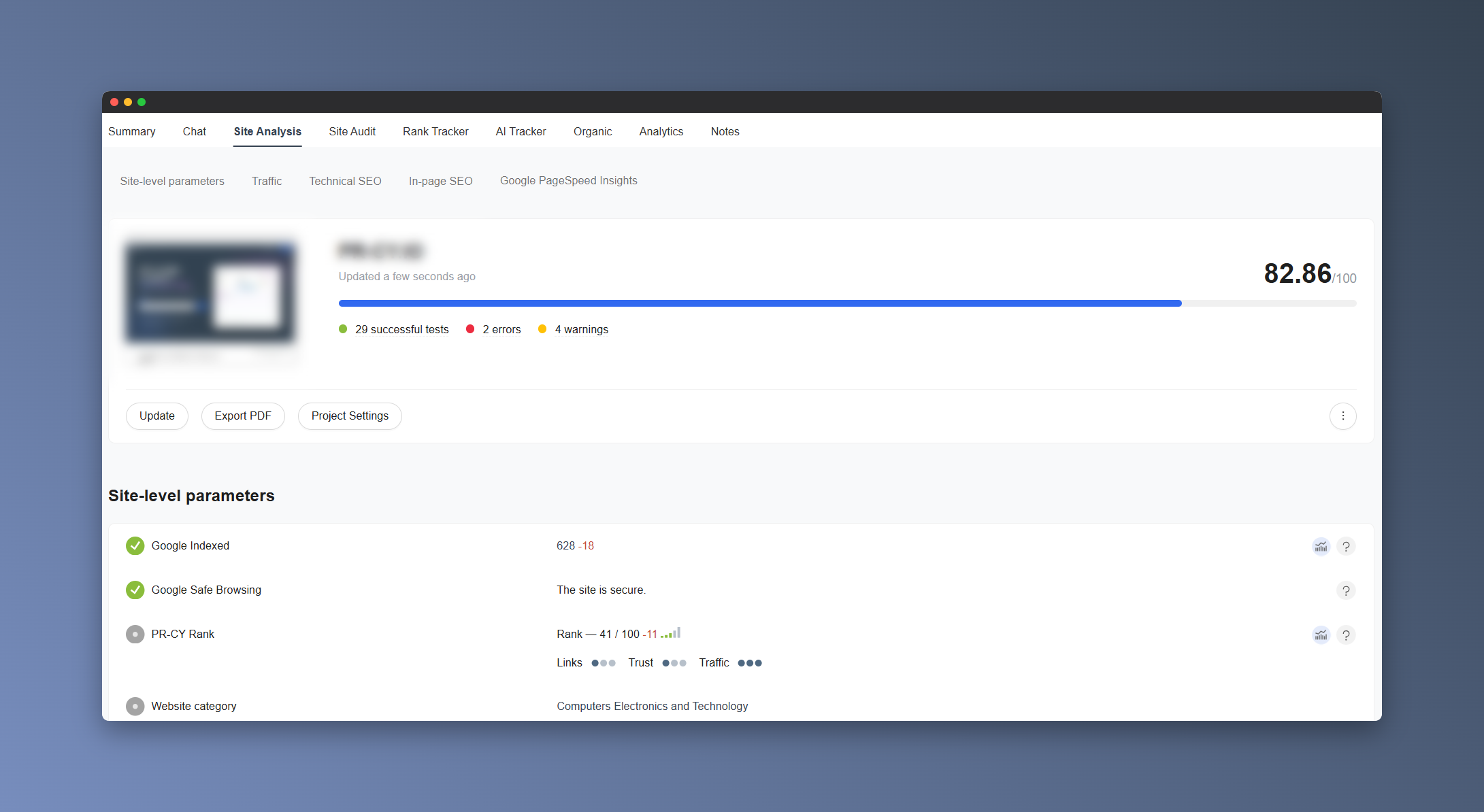
This kind of check is useful both for pages that adapt from desktop to smartphones and for websites created using the Mobile First method.
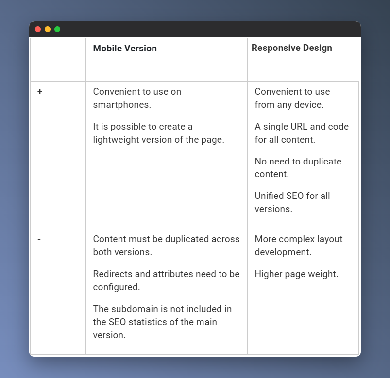
Mobile Version or Responsive Design
One way to implement Mobile First is to create a separate mobile version. It is usually placed on a subdomain like m.site.com and duplicates the main version.
A more modern way to make your website Mobile Friendly is to use responsive design. This is a layout method where content is not duplicated for different devices but instead adjusts to the screen size.
Both a mobile version and responsive design have their pros and cons. Nevertheless, the responsive approach is now considered the standard in web development and is recommended by Google for compliance with Mobile First.
Examples of Mobile Design
Responsive design is the most common way to create a convenient and full-featured version of a website for viewing on a smartphone. Its convenience is most clearly visible on pages with content arranged in a grid.
If a website consists of several sections, when developing the mobile version, they may be hidden in a burger menu or replaced with separate buttons leading to them. This makes the website look similar to a mobile app.
Classic mobile versions on separate subdomains are gradually giving way to responsive options. But not all large websites are in a hurry to adopt the new principles. Sometimes a site keeps a subdomain that is well optimized for mobile viewing.
FAQ for this section
What’s better for SEO: responsive design or a separate mobile version?
If you have a choice, go with responsive design. It’s easier to maintain, reduces the risk of discrepancies in content and metadata, and is usually faster to scale.
Can I make the mobile version lighter and hide some of the content?
You can change the way content is presented — for example, using accordions or tabs — but key content, headings, title/description, and markup must be available on the mobile version. Otherwise, you’ll be cutting down what gets into the index yourself.
Is it bad if I have an m. subdomain?
Not necessarily. But it requires stricter control: canonical/alternate tags, redirects, access to resources, identical metadata, and structured data.
Benefits of Mobile First for business: traffic, leads, conversion
Here are a few situations where high-quality mobile design and well-developed SEO become the key to success.
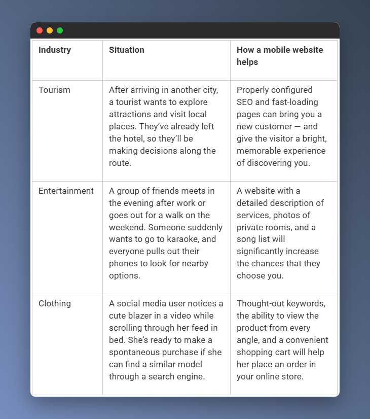
In all these scenarios, the accessibility and speed offered by a mobile website play an important role. In this respect, it even outperforms an app, which first needs to be downloaded and then logged into.
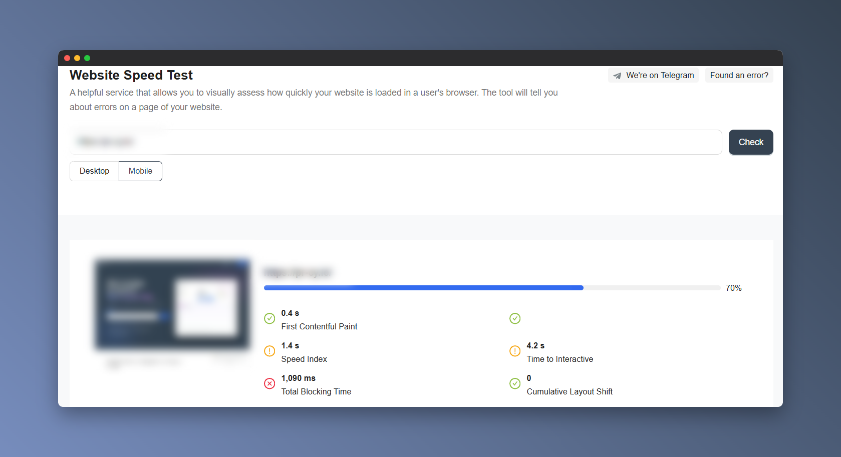
You can check your website speed using special services — for example, with the Website Speed Test tool. You’ll see how quickly your website loads in a user’s browser: separately for the mobile version and for desktop.
FAQ for this section
Why does mobile speed affect sales more than beautiful design?
Because on smartphones, users have less patience for delays: if a page takes too long to load or “jumps around,” they leave. This affects both conversion and behavioral signals.
Do I need a mobile version if I already have an app?
Yes. An app does not replace search. People come from Google to the browser and decide there whether to buy or not.
What should be checked first for e-commerce?
The catalog/product page, filters, cart, and payment flow: this is where mobile UX most often “breaks.”
Mobile-First and SEO in 2026: What Matters for Google and Core Web Vitals
Mobile-first was rolled out in stages, and some websites continued to be indexed under the old rules for a long time. The final stage was confirmed after July 5, 2024: even the remaining “desktop” websites were switched to Googlebot Smartphone. If a website is not accessible on a mobile device, it may stop being indexed.
For the entire industry, this became a clear signal that SEO is not just about keywords and links. Today, user experience factors matter too: interface usability, loading speed, readability, and visual stability.
Websites without a mobile version or with poor smartphone adaptation lose visibility. They may end up at the bottom of search results, even if their content is strong.
Core Web Vitals in 2026: LCP, INP, CLS
If you are optimizing mobile SEO, focus on Core Web Vitals. The key update: instead of the FID metric, INP — Interaction to Next Paint — is now used. It evaluates page responsiveness across all user interactions, not just the first click.
- LCP — loading speed of the main content good: up to 2.5 seconds.
- INP — interface responsiveness good: up to 200 ms.
- CLS — visual stability good: up to 0.1.
How to Prepare Your Website for Mobile-First SEO: A Short Checklist
Here’s how you can improve SEO according to Google’s requirements:
- Optimize media and JS/CSS: remove unnecessary elements, compress images, enable caching.
- Make sure the mobile version includes all key content, headings, and metadata title/description.
- Ensure that texts are easy to read: short paragraphs, appropriate font size, and enough “breathing room.”
- Don’t overload the screen with banners and pop-ups: they hurt UX and interfere with interaction.
- Make CTAs and navigation clear: buttons should be clickable, forms should be convenient, and links should lead to relevant pages.
FAQ for this section
Is INP just another metric, or does it really affect SEO?
INP is part of Core Web Vitals, and CWV are included in page experience signals. When relevance is equal, a page with better UX has an advantage.
Do Core Web Vitals need to be optimized across the entire website?
Start with the pages that bring traffic and revenue: the homepage, category pages, product/service pages, top-performing articles, and lead forms.
Why did rankings drop after switching to a responsive design?
A common reason is that content/metadata/markup on mobile started to differ from the desktop version, issues appeared with redirects/robots, or LCP/INP/CLS got worse.
Common Problems When Switching to Mobile-First
Mobile-first ranking issues can occur if:
- The responsive design turns out to be too heavy and slow.
- Complex widgets are used and take a long time to load.
- Important content is not visible right away and requires clicking a button or opening a menu.
- Images and videos have been removed or hidden.
- Not all HTML, CSS, or JS elements are available in the mobile version.
Mistakes That Kill Mobile-First Indexing
Let’s take a closer look at some mistakes related to the mobile version.
Differences in Content Between the Two Site Versions
Reminder: anything Google cannot see on the mobile page will not make it into the search engine index. Even if the desktop version contains more complete content.
If you treat the mobile version as a short summary of the “main” version, a significant share of users may not get the information they need — or may not see your site in search results at all.
Yes, developers may shorten texts and hide some elements to make the layout fit smaller screens, but this can hurt rankings. The same applies to SEO elements — title, description, and headings.
Incorrect Attribute Settings
Identical content on different pages may be perceived by a search engine as duplication, which can negatively affect SEO. To avoid this, you need to correctly set page attributes when duplicating the mobile version on another URL.
- rel="canonical" indicates the canonical, or preferred, URL. If you have separate URLs for the mobile version, such as m., Google recommends making the desktop URL canonical: on the mobile page, the canonical points to the desktop version, while on the desktop page, the canonical points to itself.
- With rel="alternate", you can specify an alternative version. For m. versions, this usually works like this: the desktop page includes rel="alternate" pointing to the mobile URL.
Some site owners exclude the mobile version of their site in robots.txt in an attempt to drive traffic to the desktop version and avoid dealing with attributes. But in this case, a search bot operating according to the Mobile First principle will not see your site at all and will not be able to add it to the index.
Design Problems
For algorithms, page design and its suitability for small screens matter. If users have to zoom in to read the text, or if the menu is so small that they can easily tap the wrong item, this is a sign of poorly developed UX. Potential problems for visitors affect indexing when Googlebot detects them.
FAQ for this section
Can part of the text be hidden?
Yes, if the content is available in the HTML and the user can open it. But don’t make an important block load only after a click — Google may not see it.
Why are canonical/alternate critical for the m. version?
An error in this connection can lead to duplicates, incorrect signal consolidation, and confusion in indexing.
Can CSS/JS be blocked in robots.txt?
It’s better not to. Google needs to crawl these resources in order to render the page correctly and evaluate its mobile UX.
Google Recommendations: A Website Mobile-Friendliness Checklist
First-hand Mobile First tips are collected in Google’s help resources. The company explains in detail how to make your website work smoothly with this indexing mechanism and avoid many of the issues described above.
Use responsive design
A responsive approach allows you to create a single project for both desktop and mobile devices. Such websites require less effort to maintain and adapt well to any usage scenario. Google states that this is the most effective and modern approach to Mobile First.
There are also alternative options:
- Dynamic serving. The same URL is used on different devices, but different HTML code is shown.
- Separate URLs for different versions. A classic example is a mobile version on a separate subdomain.
Google does not rule out using these methods, but notes that implementing them will require additional steps.
Make sure Google can access your content
Search bots must be able to see your pages and their content in order to add them to Google’s index, so:
- Do not block links using disallow attributes or robots.
- Do not hide SEO-critical content behind additional actions — expandable elements, buttons, etc.
Place the same content and data across all versions
Google carefully checks whether website content matches across different versions. Without this, the search bot may decide that they are two different websites, which can lead to SEO problems.
- Publish the same content on the mobile version as on the desktop version.
- Structure data in the same way for both versions.
- Use the same metadata for titles and descriptions.
Check videos and images
Visual content can play a critical role in how a website behaves. Google should not encounter long loading times or broken files.
- Use optimal web formats: for example, JPEG, PNG, WebP for photos and MP4, MOV, and WebM for videos.
- Publish high-quality images in both versions.
- Use the same tags and file names across all platforms.
- Place photos and videos where users can see them.
Tips for mobile versions with separate URLs
If you create a mobile version at an alternative address:
- Verify ownership of both website versions in Google Search Console.
- Create identical pages for error messages and make sure they work correctly.
- Do not use URL fragments — parts of links that begin with #.
- Check hreflang, canonical, and alternate attributes, as well as robots.txt settings.
- Ensure sufficient server capacity so they can handle the increase in mobile indexing.
FAQ for this section
Where should I check mobile-friendliness now that the Mobile Usability report has been removed?
A combination of Search Console (URL Inspection + Core Web Vitals report) and Lighthouse/PageSpeed Insights covers most tasks.
Do I need different title/description tags for mobile and desktop?
No. Google recommends using the same metadata: this makes it easier to avoid inconsistencies and indexing issues.
What is the biggest risk with an m-dot version?
Incorrect redirects (all pages leading to the mobile homepage), different metadata/content, and canonical/alternate errors.
🍪 By using this website, you agree to the processing of cookies and collection of technical data to improve website performance in accordance with our privacy policy.